RETRetail
What Is Visual Merchandising? A Plain Guide for Small Shops
Published 4 min read
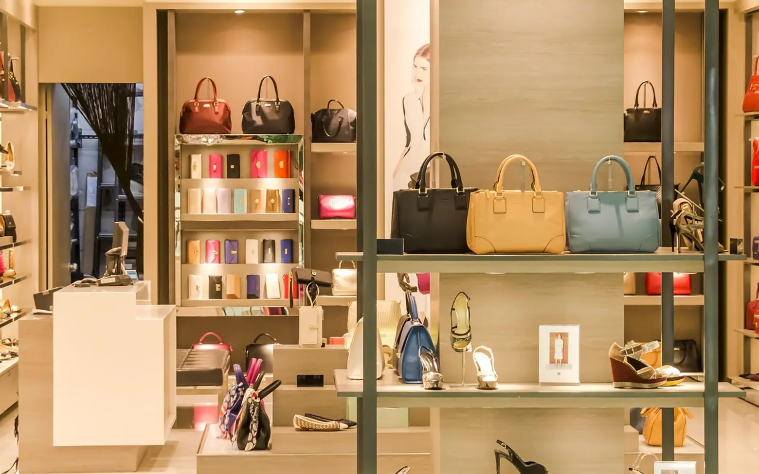
Visual merchandising is the practice of arranging a shop's products, fixtures, lighting and signs so that customers notice items, understand them quickly and feel like buying them. It covers everything from the window to the till, including store layout, shelf planning, displays and the small cues that guide someone around the floor.
Large chains have whole teams for this. A small shop does not need one, but the same principles apply, and many of them cost time rather than money.
The main building blocks
| Element | What it is | What it does for the shop |
|---|---|---|
| Window display | The arrangement passers-by see from outside | Signals what the shop sells and gives people a reason to step in |
| Store layout | The route of aisles, tables and walls | Shapes how customers move and how much of the stock they pass |
| Planogram | A diagram showing exactly where each product sits on a shelf or fixture | Keeps displays consistent, makes restocking easier and shows what is missing |
| Focal points | Eye-catching displays placed where people naturally look | Highlights new arrivals, seasonal ranges or higher-margin items |
| End caps | Displays at the end of an aisle facing the main walkway | Gives a product extra visibility to people who never walk down that aisle |
| Lighting and colour | Overall brightness plus accent lights on key displays | Sets the mood and draws the eye where you want it |
| Signage | Price tickets, category signs, posters and screens | Answers questions before a customer has to ask |
Layouts: choosing a route
Three layouts cover most shops. A grid, with parallel aisles, suits groceries, pharmacies and hardware, where customers come for specific items. A loop (sometimes called a racetrack) leads people around a circuit that passes most of the stock, common in larger homeware and department stores. A free-flow layout scatters tables and rails and invites browsing, which suits fashion, gifts and boutiques.
Whatever the shape, look at where customers really go. Many people drift to one side on entering, and the first few steps inside the door, sometimes called the decompression zone, are where shoppers adjust to the space and take in little detail. Keep that area uncluttered and put your first strong display just beyond it.
Planograms without the jargon
A planogram can be as simple as a phone photo of a well-stocked shelf with notes on it, or a drawing on squared paper. Its job is to record what goes where, how many facings each product gets and which items sit at eye level. Distributors and brands often supply planograms for their ranges; if you stock beauty or personal care lines, our overview of the cosmetics distribution landscape in the USA touches on how suppliers and retailers share that work.
- Place bestsellers and higher-margin items around eye level.
- Group items that are used together, such as a cleanser beside its refills.
- Keep heavy or bulky goods low for safety.
- Leave a little space for new lines instead of cramming every gap.
Building a display that works
- Pick one idea. A colour, a season, a problem solved, a gift for a certain person. Displays that try to say five things say nothing.
- Build height. Use risers, crates or stacked boxes so the eye travels up and down rather than across a flat table.
- Group in odd numbers. Many merchandisers favour clusters of three or five because they look less rigid than pairs.
- Light it. A single spotlight on a display can lift it more than any prop.
- Label it. A short sign with the price and one helpful line saves a customer from hunting for information.
- Refresh it. Regular visitors stop seeing a display that never changes.
Where screens fit in
Digital signage brings movement into the shop: a short loop showing a product in use, a menu that changes through the day or a window screen that stays visible after closing time. Our piece on the power of digital signage advertising covers content and placement in more depth. Screens work best as part of the display, not as a replacement for good product arrangement.
Layout and loss go together
Good merchandising also keeps stock safe. Clear sightlines from the counter, tidy shelves where gaps are obvious and careful placement of small, valuable items all reduce losses. Our guide to what shrinkage in retail is covers the other causes and how to measure them.
How to tell whether a change worked
You do not need special software to test ideas. Change one thing at a time, note the date and compare sales of the affected products over the following weeks against the weeks before. Watch how customers move, ask staff what people ask about most, and keep a simple log. Over a season, the log tells you more about your shop than any rule of thumb.
Is visual merchandising only for physical shops?
The term grew up in bricks-and-mortar retail, but the same thinking applies online: product photos, category pages and homepage features play the part of windows and focal points.
How often should displays change?
Many shops refresh the window and main focal points every few weeks and rework the layout seasonally. The right rhythm depends on how often your regular customers visit.
Questions? Write to us.
A short note is enough.