RETRetail
Designing an Online Store for a Small Retailer: What Shoppers Need to See
Published 5 min read
A good online store for a small retailer does three things well: it lets shoppers find the right product quickly, it gives them enough detail to buy without handling the item, and it gets them through payment with as few steps as possible. The rest of this guide walks through each part in the order a customer meets it.
Start with the products, not the homepage
Most visitors arrive on a product page from a search or a shared link, not the homepage. That page carries the sale, so plan it first.
Photos that answer questions
In a physical shop a customer can pick something up, turn it over and check the label. Online, photos have to do that work. A useful set for each product usually includes:
- a clean main shot on a plain background, so the item reads clearly in a grid of thumbnails;
- close-ups of texture, stitching, finish or fastenings;
- a shot that shows scale, such as the item in a hand, on a shelf or worn;
- every colour or variant photographed separately, rather than one picture with a note saying "also in blue".
Keep lighting and angles consistent across the range so category pages look orderly. Large image files slow pages down on phones, so export them at a sensible size; the explainer on what lossy and lossless compression trade away helps when choosing export settings.
Descriptions written for a buyer
Rewrite supplier text so the first line says what the product is and who it suits, then cover materials, dimensions, care and anything that commonly causes returns, such as sizing or compatibility.
Categories and filters that mirror how people shop
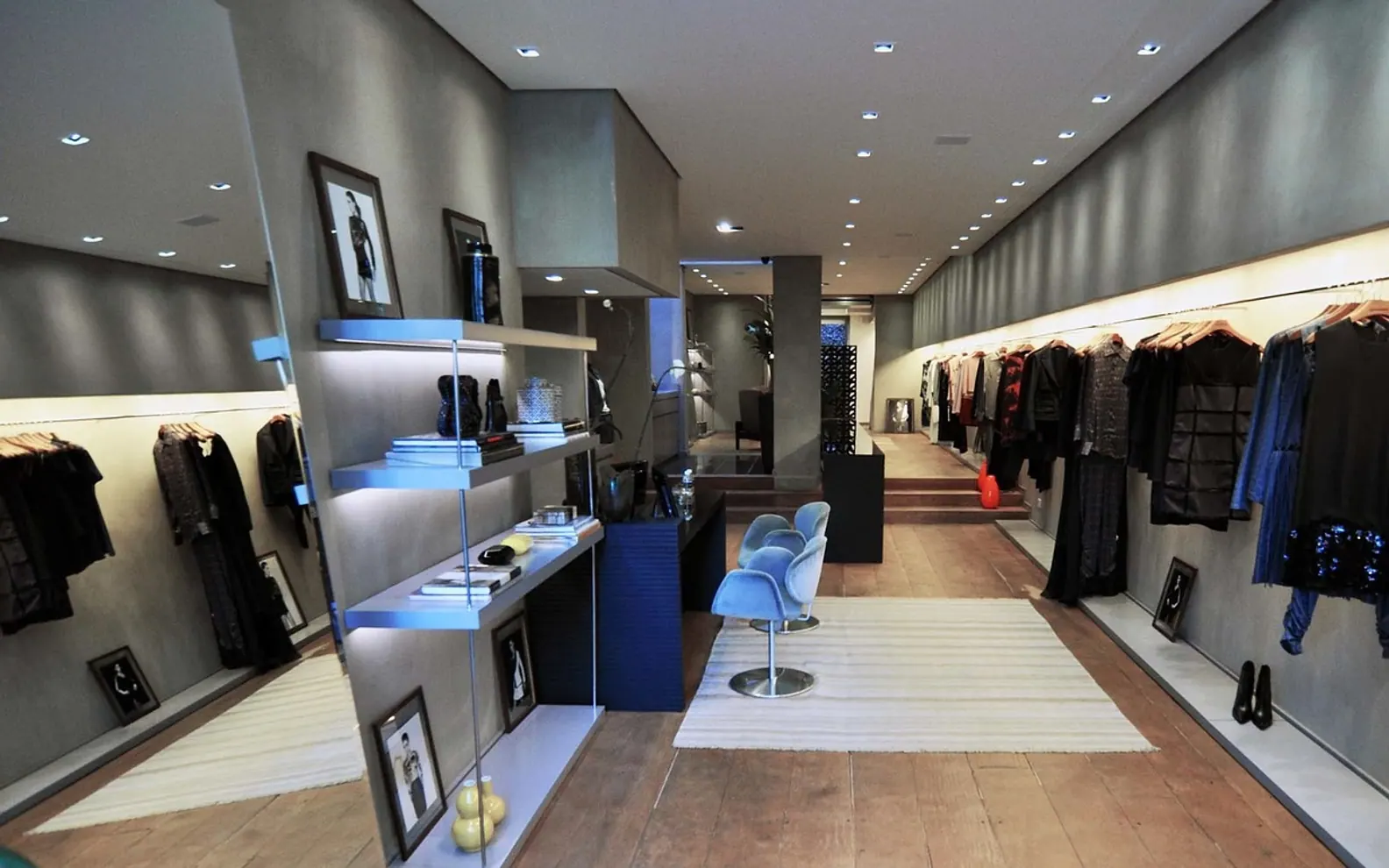
Online categories play the same role as the layout of a shop floor. If you have already thought about how products are grouped and displayed in store, much of that thinking carries over. A few principles help:
- Name categories in customers' words. Internal codes or supplier ranges mean little to a visitor.
- Keep the top level short. A handful of main categories, each with clear subcategories, is easier to use than a long flat list.
- Let a product sit in more than one place when it genuinely belongs there.
- Add filters only where the range is deep enough. Size, colour, material and price band are common. A filter that returns one or two items mostly adds clutter.
Include a search box that tolerates misspellings, and make sure an empty result offers links to popular categories rather than a blank page.
Delivery and returns information people can find
Uncertainty about delivery is one of the main reasons shoppers hesitate. Put the essentials where they are needed rather than only on a separate policy page:
| Question shoppers ask | Where to answer it |
|---|---|
| Do you deliver to my area, and how? | Product page summary and the cart |
| When will it arrive? | Product page and checkout, in plain terms |
| Can I collect from the shop? | Product page, cart and checkout options |
| How do returns and exchanges work? | A short line on the product page, with a link to the full policy |
| Who pays for return postage? | Returns policy, stated clearly |
Consumer rules on refunds, faulty goods and distance selling differ between countries, so check the requirements that apply to your business before writing the policy.
A short checkout, with guest checkout switched on
Every extra field or page in the checkout is another point where someone may give up. Practical steps:
- Offer guest checkout. Invite people to create an account after the order, when the benefit is obvious.
- Ask only for what you need to deliver the order and contact the customer.
- Show the full cost, including delivery, before the final step rather than at the end.
- Keep a visible summary of the cart throughout, with a simple way to change quantities.
- Send a clear confirmation email with the order details and what happens next.
On payments, most shoppers expect card payments plus at least one wallet or alternative method common in your market. Your payment provider will set out its own security and fraud requirements; follow them closely.
Keeping stock in step with the physical shop
A retailer selling both in person and online has one pool of stock and two sales channels. If they are not connected, the site will sooner or later sell an item that left the shelf that morning. Options range from a point-of-sale system that updates the website automatically, which needs product codes to match exactly in both systems, to a manual routine of adjusting quantities at set times each day. Whichever route you choose, hold back a small buffer on fast-selling lines and decide in advance what the site should show when an item runs out: hidden, marked as sold out, or open for back orders.
Designing for the phone first
Many visitors will browse on a phone, often on the move. Check that buttons are easy to tap, images load without long waits, text is readable without zooming and the checkout works with a phone's autofill. Test the full path on a real handset.
Some owners build the store themselves on a hosted platform; others bring in outside help for the design and setup. A retailer in New Zealand comparing local options might, for instance, review how a Website Company New Zealand describes its approach to online shops before deciding which parts to hand over and which to keep in-house.
Running the store week to week
Launch is the start of the work. A simple routine keeps the store reliable:
- review stock levels and update photos or descriptions when products change;
- place a test order now and then to make sure checkout and emails still behave;
- read through returns for patterns, such as a size that runs small or a colour that looks different in person, and fix the product page.
Should a small shop list its whole range online?
Not necessarily. Starting with the lines that sell steadily, photograph well and ship easily lets you learn the routine before adding fragile, bulky or one-off items.
What is the first thing to fix if visitors leave without buying?
Look at the point where they leave. Exits on product pages often point to missing detail or photos; exits in checkout often point to surprise costs or too many steps.
Questions? Write to us.
A short note is enough.